Landing Page Vs. Homepage: What’s the Difference?

Everyone has some understanding of what a homepage on a website is. However, there is more confusion around landing pages and what they are exactly, when to use them, and how they differ from a homepage.

Both these web pages are crucial to your website and digital marketing success. But to be successful, you need to understand the differences between them.

You also need to know how to optimize both to reach your goals and understand that you can’t use the same techniques for your homepage and your landing pages.

Keep reading to understand the main differences between a homepage and a landing page and what you can do to optimize both.

What’s the Difference Between a Landing Page and a Homepage?

Homepage and landing page are sometimes, in error, used interchangeably. But they have different purposes, goals, and designs, among other things.

The source of traffic can also vary significantly between a homepage and a landing page.

Characteristics of a Homepage vs. a Landing Page

The following are the main characteristics of a homepage and of a landing page.

Homepage


The homepage is what occupies a website’s root domain. It’s used to encourage visitors to go deeper into the website by directing them to other pages on the domain.

It’s generally used to direct visitors to your main, high-level pages, through which visitors can then find other pages which in turn will lead them to more web pages.

A full navigation, featuring multiple links, as well as other outbound links on the homepage, help in directing visitors and guiding them to these other pages.

The homepage acts as an overview of the company and what can be found on the website. Along with internal links, the homepage often features contact information and links to social media accounts.

Just because visitors may “land” on your homepage first, doesn’t make it a landing page.
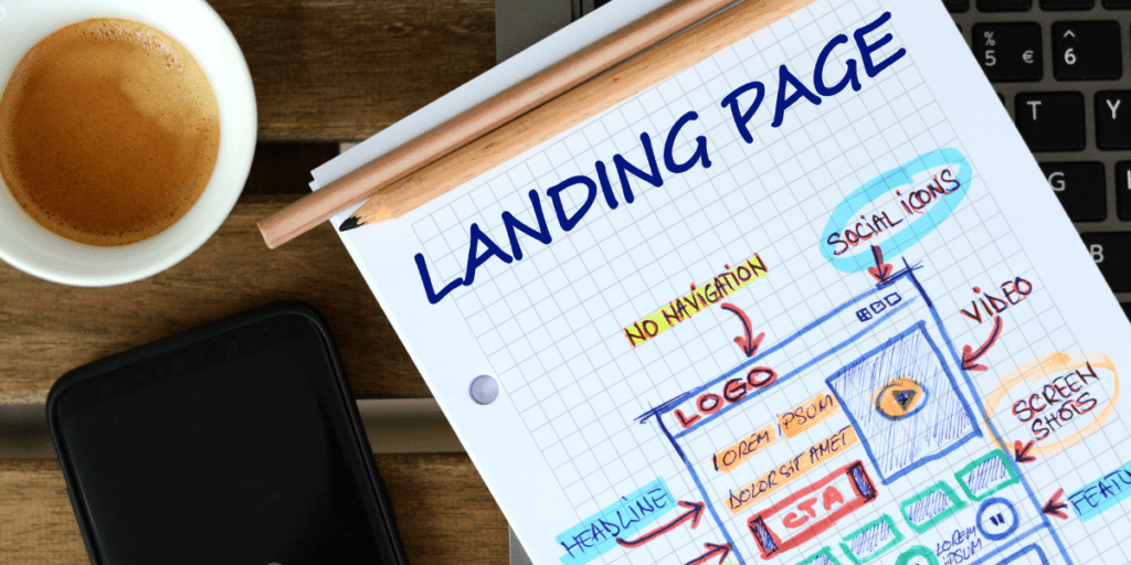
Landing Page


A landing page, on the other hand, offers specific information that the visitor is looking for. The content on these pages focuses on a specific category, topic, or campaign. Landing pages are often linked to from social media promotions, web or search ads, or emails.

The main goal of these pages is to convert visitors. They are designed to get visitors to click on one specific call-to-action or get them to complete one other action, such as filling in a web form.

If visitors arrive on your landing page after clicking on a promotional link, they’re considering taking advantage of what you promoted. Whether that’s a free resource, a
quote, or a special offer or discount code. The landing page should provide only additional information and a way for them to claim the offer.

Unlike the homepage, these pages aren’t intended to lead visitors to other web pages. That’s the opposite of what these pages try to do.

You want to avoid triggering the “paradox of choice” by giving too many options on your landing page. Landing pages should give no options other than what you’re promoting. Offer one thing and one CTA.

As a basic guideline, a landing page should:

  • Be used as a landing place for traffic from ads and other mediums promoting a certain offer. Information on the page needs to expand on what was in the traffic driving message.
  • Provide a strong CTA that funnels visitors toward your desired action.
  • Focus on one offer only.
  • Not use a navigation or include any outbound links unless needed for conversions.
  • Not be a permanent page on your domain. A lot of offers and ad campaigns run for a minimal time. Unpublish and redirect the landing page once the offer is over.
landing page website design

Types of Landing Pages

There are two main types of landing pages: click-through and lead generation landing pages. 

Click-Through Landing Pages

These landing pages have the goal of getting visitors to click through to another page.

Lead Generation Landing Pages

The goal of these landing pages is to capture leads using forms. Visitors are encouraged to provide some personal information (name, email, etc.) on a form to get something in return (a resource like a checklist, a quote, a newsletter, etc.)

Four Main Differences Between a Homepage and a Landing Page

When comparing a homepage to a landing page, these are the four main differences you’ll find.

1. Their Purpose and Audience

Landing pages are intended to attract one specific audience. They’re used to attract people interested in one particular offer. The people arriving on these pages most likely clicked through a search ad, social media promotion, or email promotion.

Each of those promotions will have informed the prospect of what will be on that landing page. So, those arriving on the page are looking to find that offer and only that.

Your promotions can also be targeted using demographics and other criteria. For search and social media ads, you can create custom audiences for your ads to be served to. For email, you can segment your list. Your landing page should then be tailored to that audience.

Most landing pages are not fully published on your website, meaning it’s difficult for other website visitors to find them allowing for a lot of target audience-based
customization. That is unless it’s a landing page for something being promoted to all website visitors such as an email signup landing page.

The homepage, however, needs to be designed for all the visitors to your website. It’s a point of navigation to make it easy for every visitor to find what they’re looking for.
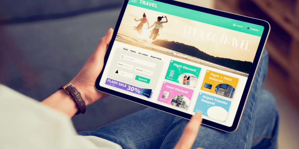
2. Their Content

Landing pages only have content related to one offer. As mentioned, you’ll have run promotions for the landing page so you know what specifically brought traffic to this page. Therefore, you need to have all your content focus on the promotion.

The landing page will use a similar message and promote what was promoted in the ad. You need to offer exactly the information they’re looking for and were told would be on the page.

The homepage will have more generalized content. It may offer an overview of your business and the content will then drive visitors to other pages.

3. Links

Landing pages are intended to convert the traffic they receive. There shouldn’t be any links except the one being used for the conversion. If the conversion is completed through form submission, that will be used in place of a link. You want the page visitors to focus on the offer, don’t give them any options for getting off of the page.

Your homepage, however, is intended to lead people off of it to other places. You’ll want to place links to your high-value pages here. Those will then lead users through other pages such as individual product pages and blog posts. There will be a primary navigation, most likely near the top of the page, plus sidebar and footer links.

4. CTAs

Landing pages are conversion-oriented, there is one action to be completed.

Homepages, however, are intended to lead visitors through the website’s content. Visitors on a homepage are looking for certain things so you need less if any, CTAs. Simply listing product or service categories along with About Us and FAQs, for example, is enough.

Your landing page will need a clear call-to-action to encourage visitors to convert. Use a straightforward and clear CTA to make a conversion more likely.

Make your website even better by implementing these 9 tips to make your website user friendly

When to Use a Landing Page

Now you understand the differences between a home page and a landing page, we discuss exactly when you should be using landing pages.

How to Use Landing Page vs. Homepage

Incentives can be a useful tool to use in your advertising campaigns. This can be promotion of a discount, free shipping, or a resource like a free e-book.

The promoted offer will likely be intended only for those that saw the ads for that campaign and will be a limited time offer. The campaign will therefore need a specific page for those who see the ads to land on.

It may also be a more permanent page for something you promote all the time such as newsletter sign-up.

Either way, you want a page that focuses only on the offer and doesn’t provide any additional navigation or links off of the page which will decrease the chance of visitors staying on your landing page and converting.
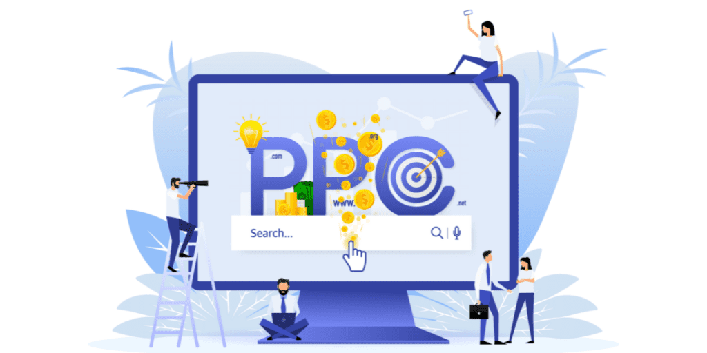
Landing Pages for Paid Search Campaigns

Pay-Per-Click (PPC) search campaigns use keywords to target those searching specific queries. The landing page allows you to focus on these queries and offer what was promoted in the search ad.

This is unless you’re targeting a broad keyword relating to your overall business such as “florists near me”. Then it’s better to use your homepage.

However, if you’re promoting a special offer then you’ll want to set up an individual landing page for this.

For example, a florist may want to promote 20% off roses if ordered for Valentine’s day. Their landing page would then show the rose bouquets that can be purchased
with this discount. They could also have an add to cart function that automatically applies the discount when the products are added to cart.

Landing Page Design

Once you understand when to use a landing page, it needs to be designed in a way that optimizes conversions. You’ll want to keep the design simple with no clutter to emphasize the content being promoted.

Too much text or too many images will make the page overwhelming. This means that it won’t be obvious what you want the user to do, resulting in lower conversion rates.

Along with a clean, minimalistic design, keep the following in mind when creating a landing page that will convert.

1. Don’t Use a Navigation

You only want landing page visitors to click your CTA or complete your desired action such as submitting a form or providing their email.

Avoid giving them any other options to get off the page by not including navigation on landing pages.

2. Get Straight to the Point

Your headline and copy both need to be simple, short, and to the point. These should provide the same message and use similar wording as used on all the mediums you promoted the page on (email copy, social media caption copy, ad copy, etc.)

The copy should provide all the information on the promoted offer above the fold. Then provide additional information below the fold such as testimonials, images of the product, etc.

3. Use a Subheading

You don’t have to use subheadings on landing pages but using a subheading is a good way to split up text and reiterate what was outlined in your headline.

4. Use Social Proof

Social proof, whereby you show in some way the positive experience other consumers have had with the offer you’re promoting, is a great tool for encouraging conversions. This is equally true on landing pages.

Social proof helps eliminate concerns and objections that visitors may have, persuading them to complete your desired action.

Some types of social proof that you can use on your landing pages include:

  • Reviews or Testimonials
  • Media mentions (ex. As featured in “publication”)
  • Numbers such as number of downloads, sign-ups, shares on social media

5. Use Images (But Not Too Many!)

Including multi-media like images, video, or infographics is a great complement to landing page copy. These can include images or videos showing the product being promoted and its benefits.

It could also include video testimonials or infographics explaining the benefits of what is being promoted or as an outline of what the visitor is getting.

For example, if you’re promoting a downloadable marketing guide, you may include an infographic outlining the main topics covered in the guide.

Just be careful not to use too many images or other media. This can make the page cluttered and confusing and make it more likely that the CTA will be missed. Try to stick to one or two images or infographics or just one video.

6. Make Forms Simple and Easy to Fill Out

You don’t want to have successfully encouraged the visitor to sign-up to your offer just to lose them due to a complicated or malfunctioning form. If using a form, make sure it’s easy to fill out and has just a few basic fields.

Once you have the visitor’s information and have provided them with what they signed up for (a resource, a quote, etc.) you can then get in touch for more information from them as well if necessary.

To start with, only ask for the information you absolutely need in order to follow up. You may then want to keep fields very simple which will generally result in more but less qualified leads. Or, you can ask a few more questions to qualify leads more, however, this can result in fewer sign-ups. 

Make sure the form also works correctly and check it frequently to make sure no errors have occurred.

7. Use Effective CTAs and Buttons

For your CTA and CTA buttons, you’ll want to use clear and very to the point copy that directs your visitors to do exactly what you want them to do. 

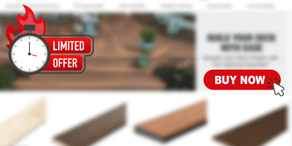
Additionally, your copy should focus on using action words such as “click here”, “submit”, or “get”. It can also help sometimes to highlight urgency. For example, you may include terms like “limited time offer” or “today only” in your CTA copy.

In regards to button design, it will need to stand out while still having a simple design. You may want to test exact sizes, shapes, and colors used to see what performs best for what types of offers.
8. Test Your Landing Page

Like with many other marketing tools, you should be testing your landing pages. A great way to do this is through A/B testing the page with a sample of your target audience before it goes live to all.

Some elements of your landing page to test include:

  • The headline
  • The offer
  • The body copy
  • The CTA copy and/or button design
  • The media included (for example, images vs. video)
  • The page design/layout

Don’t be intimidated by website analytics. Start with the basics. Learn what metrics to track, what tools to use, and how to apply the insights to make the most of your website.

Using Visual Hierarchy to Guide Visitors

When designing both homepages and landing pages, you need to think about the way web pages are viewed. In general, visitors read the headline or look at the top image first, then go to the left-hand side to glance for lists and subheadings, and then read the main copy.

Think about this pattern when adding information to your pages. You can also conduct heat mapping to see exactly how your visitors view your pages.

Place the most important information in the area that they look first. For example, a straight to the point headline emphasizing the offer on a landing page. Forms, for example, should always be placed on the right-hand side of a page. Filling them in is the last step that you want visitors to complete.

They’ve read your copy and why they should provide their information so the last step is to fill in and submit the form. People will also read left to right so you want the copy on the left for them to read first and then the form on the right of that.

In Conclusion

Homepages and landing pages exhibit many differences from their design to their purpose. You’ll need to use both, however, when running a website and digital promotions.

By understanding their differences, uses, and how to optimize both, you’ll be able to convert visitors to your landing pages and lead visitors through your website from your homepage effectively.

If you’re still not quite sure how to set up your homepage and landing pages, Brand Hause offers website design services including landing page and homepage creation and optimization.

Get in touch for a free web design consultation today to discuss your needs and get started on building a website that achieves your goals.

Do you want to create landing pages that work? We can help your business grow and thrive with landing pages that generate leads and convert customers.

Join the conversation!

Leave a Comment

Your email address will not be published. Required fields are marked *

Join the conversation!

Scroll to Top

Get our insights delivered straight to your inbox and improve your marketing.

Get in touch

Let us know if you’d like to discuss a specific project or marketing challenge. We look forward to talking with you!